Author Topic: Here's how bad Siglent's (SDS1104X-E) GUI is  (Read 8489 times)

0 Members and 1 Guest are viewing this topic.

Offline Bob SavaTopic starter

  • Regular Contributor
  • *
  • Posts: 98
  • Country: us
Here's how bad Siglent's (SDS1104X-E) GUI is
« on: April 05, 2018, 04:24:22 pm »
Look at the screenshot below and tell me (hint - you cannot  :palm:)

regarding channel settings:
what is the attenuation ratio set for each input?
fine or coarse adjustment?
deskew value?
which channel is inverted?

trigger settings:
limit range?
is noise reject on?

acquisition:
which acquisition mode is currently on?
memory depth?
is acquisitionmode fast or slow?
interpolation Sinx or x?

 :-// Even one letter or tiny icon pertaining to each setting would make a difference. 


I'll not even complain that AC and DC mode icons are not very distinct or that would prefer for channel icon to 'gray out' instead of totally disappear with all it's setting info.

Would I switch to Rigol or some other scope knowing all this - not really because I neither have a budget or want >5yr old technology.  I'm more than little annoyed as I feel it's very basic stuff that should be there.
« Last Edit: April 05, 2018, 04:57:28 pm by Bob Sava »
 

Offline BillB

  • Supporter
  • ****
  • Posts: 615
  • Country: us
Re: Here's how bad Siglent's (SDS1104X-E) GUI is
« Reply #1 on: April 05, 2018, 05:29:26 pm »
While I kinda agree, I'm not sure how much information you can cram onto the screen at one time before it becomes an overloaded, jumbled mess.  :-//  Maybe a bunch of little icons in each channel block on the right?
 
The following users thanked this post: kg4arn

Offline abraxa

  • Frequent Contributor
  • **
  • Posts: 377
  • Country: de
  • Sigrok associate
Re: Here's how bad Siglent's (SDS1104X-E) GUI is
« Reply #2 on: April 05, 2018, 05:56:27 pm »
Personally, I think you're asking for settings to be always visible that make little sense to be always on-screen for the general user. How often do you change these settings as a general user? Most users won't change them often (if at all) and won't mind having to touch a few buttons to check what it's currently set to, if it gains them usable screen space in exchange.
When designing the UI, the design team needs to consider whether space is better used on the trace or on other information. To me, their choices make sense.
 

Offline Bob SavaTopic starter

  • Regular Contributor
  • *
  • Posts: 98
  • Country: us
Re: Here's how bad Siglent's (SDS1104X-E) GUI is
« Reply #3 on: April 05, 2018, 06:27:27 pm »
@abraxa I do apreciate that Siglent is reserving more space for signal than others.  However, I don't buy that they've run out space excuse.   As @BillB observed it appears there's enough of space on the right hand side, for example.

Additionally, some information does not need real-estate at all and could be conveyed by emboldening a font, inverting text or change of color.

To your second point, even options that are not used often deserve an indicator for two reasons: when you look at a screenshot you've taken earlier - there are no buttons to press to reveal how scope was set.  Also,  settings that are used less often could trip you up because you tend to assume their state.


Offline rsjsouza

  • Super Contributor
  • ***
  • Posts: 6071
  • Country: us
  • Eternally curious
    • Vbe - vídeo blog eletrônico
Re: Here's how bad Siglent's (SDS1104X-E) GUI is
« Reply #4 on: April 05, 2018, 06:28:31 pm »
I personally only care for those missing items:
- which acquisition mode is currently on?
- memory depth?


If the oscilloscope does not have probe sense, then I would care for:
- what is the attenuation ratio set for each input?
Vbe - vídeo blog eletrônico http://videos.vbeletronico.com

Oh, the "whys" of the datasheets... The information is there not to be an axiomatic truth, but instead each speck of data must be slowly inhaled while carefully performing a deep search inside oneself to find the true metaphysical sense...
 

Offline Elasia

  • Frequent Contributor
  • **
  • Posts: 726
  • Country: us
Re: Here's how bad Siglent's (SDS1104X-E) GUI is
« Reply #5 on: April 05, 2018, 06:55:16 pm »
Personally, I think you're asking for settings to be always visible that make little sense to be always on-screen for the general user. How often do you change these settings as a general user? Most users won't change them often (if at all) and won't mind having to touch a few buttons to check what it's currently set to, if it gains them usable screen space in exchange.
When designing the UI, the design team needs to consider whether space is better used on the trace or on other information. To me, their choices make sense.

Or even if you do change them or forget what it was set on, as long as you can pop the menu and it tells you what its set on then who cares.. +1 to more screen space. As part of an analysis I keep the settings in an excel file usually as well so the conditions the data was collected from the scope so they are known.

The settings themselves are almost always kept in some other form for anyone doing analysis work so it can be repeated by other people and confirmed. So not just general users either probing about..

In fact i'd rather have all the menus off for the most part to get more screen space on a scope
 

Online tautech

  • Super Contributor
  • ***
  • Posts: 29494
  • Country: nz
  • Taupaki Technologies Ltd. Siglent Distributor NZ.
    • Taupaki Technologies Ltd.
Re: Here's how bad Siglent's (SDS1104X-E) GUI is
« Reply #6 on: April 05, 2018, 07:42:23 pm »
Short reply.....more later.


Let's see some constructive replies on how the GUI can be improved.  :popcorn:

« Last Edit: June 03, 2018, 05:14:58 pm by tautech »
Avid Rabid Hobbyist.
Some stuff seen @ Siglent HQ cannot be shared.
 

Offline Bob SavaTopic starter

  • Regular Contributor
  • *
  • Posts: 98
  • Country: us
Re: Here's how bad Siglent's (SDS1104X-E) GUI is
« Reply #7 on: April 05, 2018, 08:34:10 pm »
https://www.eevblog.com/forum/testgear/here's-how-bad-siglent's-(sds1104x-e)-gui-is/msg1471378/#msg1471378

Specifically:

"some information does not need real-estate at all and could be conveyed by emboldening a font, inverting text or change of color"
« Last Edit: April 05, 2018, 08:49:10 pm by Bob Sava »
 

Offline rsjsouza

  • Super Contributor
  • ***
  • Posts: 6071
  • Country: us
  • Eternally curious
    • Vbe - vídeo blog eletrônico
Re: Here's how bad Siglent's (SDS1104X-E) GUI is
« Reply #8 on: April 05, 2018, 08:47:52 pm »
Regarding the precise/imprecise, I would be a bit more subtle: why display 5.00V/div or 10.0mV/div in imprecise mode? I would simply show 5V/div or 10V/div or 2.5V/div and so on.

IMHO the attenuation clutters the information of the much more useful V/div.

I can see the benefit in leaving the inactive channels greyed out.
Vbe - vídeo blog eletrônico http://videos.vbeletronico.com

Oh, the "whys" of the datasheets... The information is there not to be an axiomatic truth, but instead each speck of data must be slowly inhaled while carefully performing a deep search inside oneself to find the true metaphysical sense...
 

Offline Bob SavaTopic starter

  • Regular Contributor
  • *
  • Posts: 98
  • Country: us
Re: Here's how bad Siglent's (SDS1104X-E) GUI is
« Reply #9 on: April 05, 2018, 08:57:00 pm »
Good idea regarding precise/coarse modes - use significant figures to indicate the mode.  As to attenuation, maybe just indicate through color or shape change that it's not X1.
 

Offline RobertPS

  • Contributor
  • Posts: 33
  • Country: nl
Re: Here's how bad Siglent's (SDS1104X-E) GUI is
« Reply #10 on: April 05, 2018, 09:49:13 pm »
While I don't think it's bad as it is now, it would be nice to have a choice in some way.
Add in or remove some settings information.


Offline Muttley Snickers

  • Supporter
  • ****
  • Posts: 2372
  • Country: au
  • Cursed: 679 times
Re: Here's how bad Siglent's (SDS1104X-E) GUI is
« Reply #11 on: April 05, 2018, 10:32:43 pm »
Our old facsimile machine had the ability to spit out a couple of pages to display all of the current configuration settings which saved going through the entire menu to verify an option, a quickly accessible screen showing this type of information might be more useful than a permanently highlighted letter corresponding to a function which if rarely used might be forgotten requiring the user to refer to a manual anyway.
 

Online tautech

  • Super Contributor
  • ***
  • Posts: 29494
  • Country: nz
  • Taupaki Technologies Ltd. Siglent Distributor NZ.
    • Taupaki Technologies Ltd.
Re: Here's how bad Siglent's (SDS1104X-E) GUI is
« Reply #12 on: April 06, 2018, 12:15:01 am »
Look at the screenshot below and tell me (hint - you cannot  :palm:)

regarding channel settings:
what is the attenuation ratio set for each input?
fine or coarse adjustment?
deskew value?
which channel is inverted?
One button push and all this info is available.
With a multiplexed control DSO, anytime you select an active channel to make an adjustment, that channel's menu becomes visible and settings can then be plainly seen and checked as correct.

Quote
trigger settings:
limit range?
is noise reject on?
One button push and all this info is available.

Quote
acquisition:
which acquisition mode is currently on?
memory depth?
is acquisitionmode fast or slow?
interpolation Sinx or x?
As above

Quote
:-// Even one letter or tiny icon pertaining to each setting would make a difference. 
There's not much screen real estate available to add any.
A while ago we had a discussion on adding 1x and 10x probe attenuation identifiers but there's no room for any of the many other attenuation values. You can follow it here and posts previous:
Maybe I should have made myself more clear:

The actual probe attenuation is not visible in the main display. Of course I know that you can find the attenuation in .....
You are quite clear.....to me anyway.

Not at all an unreasonable request so I'll shoot it through to Tech support and see if Siglent will add it in FW.
Of course large attenuation factors will be hard to find room to display on the ch tab and it may be a reason why it is not implemented in the channel tab.

Even 100x (a common attenuation) would be a squeeze.
As you can see in my previous screenshot there are small gaps in the channel tabs to add attenuation settings......at the risk of confusion to the inexperienced user. 10:1 x.xV/div or 10:1 x.xV vertical position ? IMHO it's better not to.
OK make the font smaller I hear you say......then there'd be complaints that it's too small. Yes there's many more options on a larger display but how much larger is needed and then we don't have a small, cheap entry level DSO anymore. How much more would you be willing to pay ?

Quote
I'll not even complain that AC and DC mode icons are not very distinct
Have you experimented with Display brightness ?

Quote
would prefer for channel icon to 'gray out' instead of totally disappear with all it's setting info.
Why ? Settings will remain as you made/left them when the channel is activated again.


This GUI has developed over ~4 years where we first saw it as a V2 firmware revision for SDS2000 (not X) models.

We need think what we need to see on the display and why. For documentation it would be convenient to see more settings and in a small way this can be mitigated by which of the menus are shown at the foot of the display when a screenshot is taken. There's also use of the Webserver page where we can capture many more settings like so:
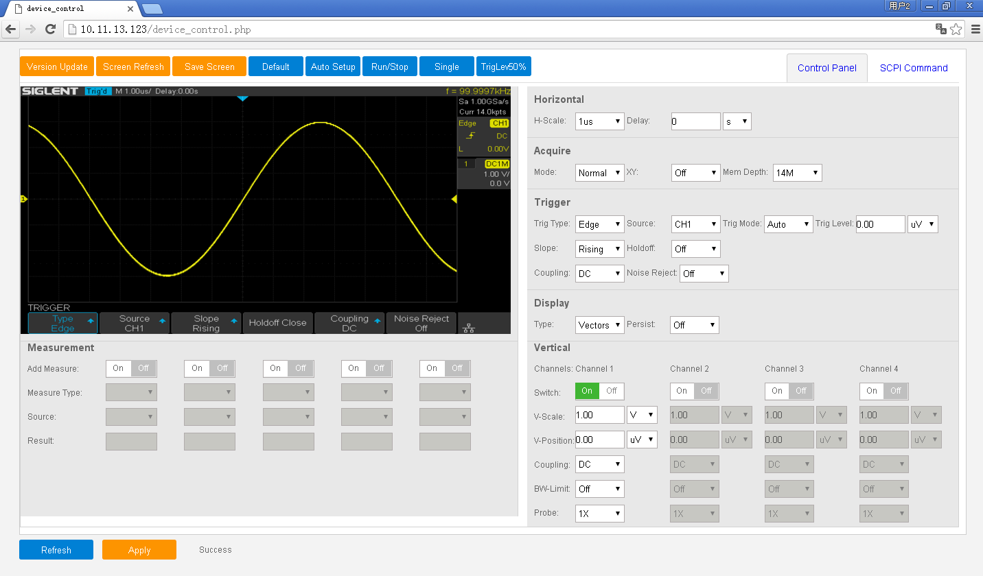


For general bench usage most of the info required is already in the tabs or around the display border.
For different attenuation probes (and probe types) that info is right in front of the user so when we need to use 1x probes on rare occasions the settings are easy to change. On higher priced scopes auto probe attenuation is commonly available but not so on DSO's at this price point.

So when you state: Here's how bad Siglent's (SDS1104X-E) GUI is, yes there are some minor improvements that could be done but at the risk of spoiling what's already pretty good compromise of the GUI design currently available.

But we're listening............


Avid Rabid Hobbyist.
Some stuff seen @ Siglent HQ cannot be shared.
 

Offline Bob SavaTopic starter

  • Regular Contributor
  • *
  • Posts: 98
  • Country: us
Re: Here's how bad Siglent's (SDS1104X-E) GUI is
« Reply #13 on: April 06, 2018, 02:26:41 am »
No one likes to press buttons and small changes to GUI would reduce button presses needed and improve screenshot readability.  As I wrote earlier, change of colors, shapes does not take more screen real-estate.  Here are few examples how small changes and 0 additional screen real-estate could reduce button presses and improve readability (realtime or screenshots). 

1) use SI prefixes for probe attenuation to keep it 3 character long max:

.1X
.2X
.5X
1X
2X
10X
20X
50X
1hX
2hX
5hX
1kX
2kX
5kX

2) as it was suggested here, for coarse/fine vertical mode use significant figures to indicate mode, for example: coarse 5V/, fine 5.00V/

3) invert AC text to better distinguish between coupling modes. 

4) for inverted channel setting - write channel number or channel description in italic


« Last Edit: April 06, 2018, 02:44:51 am by Bob Sava »
 
The following users thanked this post: tautech

Online tautech

  • Super Contributor
  • ***
  • Posts: 29494
  • Country: nz
  • Taupaki Technologies Ltd. Siglent Distributor NZ.
    • Taupaki Technologies Ltd.
Re: Here's how bad Siglent's (SDS1104X-E) GUI is
« Reply #14 on: April 06, 2018, 03:35:48 am »
No one likes to press buttons and small changes to GUI would reduce button presses needed and improve screenshot readability.  As I wrote earlier, change of colors, shapes does not take more screen real-estate.  Here are few examples how small changes and 0 additional screen real-estate could reduce button presses and improve readability (realtime or screenshots). 

1) use SI prefixes for probe attenuation to keep it 3 character long max:

.1X
.2X
.5X
1X
2X
10X
20X
50X
1hX
2hX
5hX
1kX
2kX
5kX

2) as it was suggested here, for coarse/fine vertical mode use significant figures to indicate mode, for example: coarse 5V/, fine 5.00V/

3) invert AC text to better distinguish between coupling modes. 

4) for inverted channel setting - write channel number or channel description in italic
Thanks Bob for your ideas, let's examine and discuss them.

1.) Yes, doable and capturing all available input attenuation settings excepting 10,000x.
      The multiplier symbol X might be best in lower case.
      I should add that if possible any input attenuation indicator should be in a position between the lines of
      V/div and ch offset V to eliminate any chance of confusion that it might apply to either of them.
2.) Standard Coarse V/div steps are very recognizable in their 1,2,5 steps and any use of Fine V/div
      adjustment is immediately identifiable in the channel tab V/div identifier. I don't think change is
      needed.
3.) Might I suggest only a thicker and therefore darker font. That will offer a better contrast against the
      colored background of the channel tab.
4.) May I suggest a better Invert'ed channel identifier, a NOT Boolean identifier, that is with a bar over like
      the reverse of this:
      DC1M

I can say it's a great satisfaction to have ideas implemented into the UI and these are worthy of consideration by Siglent. Let's see what they think....after they get back from Ching Ming Holiday on Monday.

« Last Edit: April 07, 2018, 12:31:03 am by tautech »
Avid Rabid Hobbyist.
Some stuff seen @ Siglent HQ cannot be shared.
 

Offline Elasia

  • Frequent Contributor
  • **
  • Posts: 726
  • Country: us
Re: Here's how bad Siglent's (SDS1104X-E) GUI is
« Reply #15 on: April 06, 2018, 12:07:45 pm »
Wow tau.. i like that webpage display.. didnt even look at the web portal part yet since well... im still waiting because of to many chinese holidays lol.. still no stock for another 2 weeks :(
 

Online tautech

  • Super Contributor
  • ***
  • Posts: 29494
  • Country: nz
  • Taupaki Technologies Ltd. Siglent Distributor NZ.
    • Taupaki Technologies Ltd.
Re: Here's how bad Siglent's (SDS1104X-E) GUI is
« Reply #16 on: June 03, 2018, 05:12:25 pm »
Wow tau.. i like that webpage display.. didnt even look at the web portal part yet since well... im still waiting because of to many chinese holidays lol.. still no stock for another 2 weeks :(
The webserver has been updated in the latest firmware.
Here's what it looks like in the expanded mode where remote scope control can be done with your mouse or at the scope of course.


The small blue X at the lower right of the scope display pops just the display onto full screen mode on your PC or laptop.
It's perfect for big screen or seminar use and the update rates from what's happening on the scope appears to be better than ~300ms.
At last a cheap scope that can be used on a big display for teaching or seminar use.  :)
Avid Rabid Hobbyist.
Some stuff seen @ Siglent HQ cannot be shared.
 

Offline bugi

  • Regular Contributor
  • *
  • Posts: 249
  • Country: fi
  • Hobbyist using the ultra slow and unsure method
Re: Here's how bad Siglent's (SDS1104X-E) GUI is
« Reply #17 on: June 03, 2018, 06:10:27 pm »
1.) Yes, doable and capturing all available input attenuation settings excepting 10,000x.
      The multiplier symbol X might be best in lower case.
Even better, use the "real" x-multiply symbol (×). Depending how it is rendered (should be slightly up from the baseline, but least it should be pure 45 degree diagonals with no serifs, compared to x depending on the font), it can be much clearer to read than x, especially after a 'k'. (My current font on the browser is a bit bad for this, as the x is almost the same, just slightly narrower.)
 

Online tautech

  • Super Contributor
  • ***
  • Posts: 29494
  • Country: nz
  • Taupaki Technologies Ltd. Siglent Distributor NZ.
    • Taupaki Technologies Ltd.
Re: Here's how bad Siglent's (SDS1104X-E) GUI is
« Reply #18 on: June 05, 2018, 09:43:38 am »
Bob, this should fix what bugged you.
New firmware 25R2

Ch 1 'I' for Inverted and all probe attenuation settings plainly visible.


Avid Rabid Hobbyist.
Some stuff seen @ Siglent HQ cannot be shared.
 

Offline Bob SavaTopic starter

  • Regular Contributor
  • *
  • Posts: 98
  • Country: us
Re: Here's how bad Siglent's (SDS1104X-E) GUI is
« Reply #19 on: June 05, 2018, 11:01:48 am »
As I tripped few times on channel being inverted w/o me knowing therefore I really appreciate the little 'I' indicator.  Same with attenuation, however, I would argue that it should not be on colored background as it makes for busy GUI and there's no need I think to emphasize it. 

It's nice to see Siglent listening and making the product better.


Offline kerouanton

  • Regular Contributor
  • *
  • Posts: 94
  • Country: ch
  • Just curious about science, radio etc.
    • Sometimes I play with radio
Re: Here's how bad Siglent's (SDS1104X-E) GUI is
« Reply #20 on: June 05, 2018, 01:54:48 pm »
On my SSA3032, nothing as such, I feel happy with the GUI except for 1 thing:

My main GUI complaint is about the "Display/Screen Text" mode, that once turned off, removes display *even when entering digits on the keypad*.

Having to enter digits such as a frequency without visual feedback is painful, and at least when Screen Text set to Off, it should display the digits typed and make they disappear after 1-2 seconds if nothing done, or if the "esc" or "enter" keys are pressed. As simple as that. (or even more simply use a dedicated space somewhere on the screen to display what digits are being punched out).

That's imho something that could be fixed easily in software.
Please, Siglent  ::)

Edit:
but in general I believe Siglent is working hard to fix things and the results are good.
« Last Edit: June 05, 2018, 01:58:11 pm by kerouanton »
 

Offline nctnico

  • Super Contributor
  • ***
  • Posts: 28113
  • Country: nl
    • NCT Developments
Re: Here's how bad Siglent's (SDS1104X-E) GUI is
« Reply #21 on: June 05, 2018, 05:05:29 pm »
but in general I believe Siglent is working hard to fix things and the results are good.
You are still in denial. If it where good to start with it didn't need so much fixing. Adding features later on is OK but fixing things which should have worked from the start just sucks.
There are small lies, big lies and then there is what is on the screen of your oscilloscope.
 

Offline rsjsouza

  • Super Contributor
  • ***
  • Posts: 6071
  • Country: us
  • Eternally curious
    • Vbe - vídeo blog eletrônico
Re: Here's how bad Siglent's (SDS1104X-E) GUI is
« Reply #22 on: June 05, 2018, 08:55:37 pm »
but in general I believe Siglent is working hard to fix things and the results are good.
You are still in denial. If it where good to start with it didn't need so much fixing. Adding features later on is OK but fixing things which should have worked from the start just sucks.
C'mon, Nico. You have to acknowledge they are showing improvement on the bug/enhancement repair factory. UI is not an easy thing to do and some of the topics shown in this thread were debatable given the screen realstate.

The A-brands have 1~2 decades of head start on graphical UI (and many more on electronics design), and see what happened with our E3631x power supplies... Fortunately they are doing it right with their efficient service.
Vbe - vídeo blog eletrônico http://videos.vbeletronico.com

Oh, the "whys" of the datasheets... The information is there not to be an axiomatic truth, but instead each speck of data must be slowly inhaled while carefully performing a deep search inside oneself to find the true metaphysical sense...
 
The following users thanked this post: gnavigator1007

Offline hendorog

  • Super Contributor
  • ***
  • Posts: 1628
  • Country: nz
Re: Here's how bad Siglent's (SDS1104X-E) GUI is
« Reply #23 on: June 05, 2018, 09:07:39 pm »
Having seen the remote web page first hand it really is very impressive and responsive. Completely different to the Rigol one I have. The full screen mode looks great.

There are a couple of extra points:

- it's a web page, so no additional software needs to be installed. This is a decent bonus  - with my DS4k the download is at least 500MB, also there no risk of compatibility issues with multiple NI driver installations etc.

- there doesn't seem to be a way to download raw trace data in CSV or some other non image format for offline processing. Easily done using USB stick or SCPI, but I think that feature should be added.


Online tautech

  • Super Contributor
  • ***
  • Posts: 29494
  • Country: nz
  • Taupaki Technologies Ltd. Siglent Distributor NZ.
    • Taupaki Technologies Ltd.
Re: Here's how bad Siglent's (SDS1104X-E) GUI is
« Reply #24 on: June 06, 2018, 01:50:02 am »
Having seen the remote web page first hand it really is very impressive and responsive. Completely different to the Rigol one I have. The full screen mode looks great.

There are a couple of extra points:

- it's a web page, so no additional software needs to be installed. This is a decent bonus  - with my DS4k the download is at least 500MB, also there no risk of compatibility issues with multiple NI driver installations etc.

- there doesn't seem to be a way to download raw trace data in CSV or some other non image format for offline processing. Easily done using USB stick or SCPI, but I think that feature should be added.
With this new 25R2 firmware it's one of the things I need to look at harder how it now handles raw data.
Meanwhile I shot a quick vid showing the scopes webserver connected via WiFi to a laptop driving a bigger display:
https://www.eevblog.com/forum/testgear/siglent-sds1204x-e-released-for-domestic-markets-in-china/msg1589632/#msg1589632
Avid Rabid Hobbyist.
Some stuff seen @ Siglent HQ cannot be shared.


Share me

Digg  Facebook  SlashDot  Delicious  Technorati  Twitter  Google  Yahoo
Smf