I'll start with a disclaimer: I'm not the person who decides what our icons look like or are named. But I'd be happy to share my personal thoughts 
Words are easy to interpret and unambiguous. The words were there , and I understood them.
The pictograms were ambiguous[1]; why were they there? What did they add to the words?
A few points:
1) For better or for worse, we live in a society that is often symbol-driven, not word-driven.
Yes, too many people are illiterate, or literate in a different language. It frightens me to think that electronic engineers are illiterate!
Apple products are an excellent example of this, but it extends well outside of electronics: automobile controls, road signs, etc. For example, the attached lawn mower warning sign: I imagine it's in everyone's best interest to convey this meaning in both words and symbols.
There's a lot of fascinating history about how the UK road signs were designed in the late 50s. In particular, there was a lot of thought given to ensuring they were distinct and unambiguous and could be understood by people that couldn't read English. A few needed to be explained
once, e.g. the man putting up an umbrella meaning "road works ahead"
That they have remained unchanged for more than half a century (and that nobody complains about them!) is a testament to their success.
2) The words are there to resolve any ambiguity as to what the icon means. I think the "gear = configuration/settings" convention is pretty universal, but as you say, many icons are not. To continue the lawn mower analogy: I once had a lawn mower with lever that had pictures of a rabbit and a turtle next to it. I used to make the (unfunny) joke that this lever was used adjust for what kinds of animals might be lurking in tall grass. And, of course, there is the classic hand dryer / bacon dispenser meme (attached)
Nice anecdote
If the words are there to remove ambiguity, then the icons are - at best - unnecessary.
My parents had a microwave oven and an electric oven and nobody could understand what the pictograms/hieroglyphs meant - even after getting out the instruction book and reading that. "Nobody" means half a dozen adults of three generations.
The instruction book for the first microwave oven I ever saw was also the assembly manual (a Heathkit GD-29 microwave) - it didn't have any icons, as far as I remember
I've built HeathKit stuff; the manuals were exemplary. No icons, either
The magnifying glass with a cross pictogram is almost the same as the search pictogram. The significance of the small religious symbol is unclear
I think it's supposed to be a "+" sign for "zoom in / increase" vs. a plain magnifying glass for search. I think these are very common, conventional symbols as well.
Therefore the icon has failed
I would assume a magnifying glass indicated magnify. Using it to mean something else is perverse!
There are two cog pictograms. What's the difference?
One is for configuring the instrument, the other is for configuring the icons - I agree that's kind of confusing
One of my favorite Latin sayings is "de gustibus (non est disputandum)" which basically means "tastes are not to be debated" There is no "correct" answer as to whether red flowers are "better" than white flowers.
On the other hand, I think it is possible to make value judgements about whether or not a symbol is a "good" symbol or not, that is, whether it effectively and efficiently conveys the desired meaning (for example, most people in Western society would say that red roses are more appropriate as a symbol of romantic love).
Sorry for the long post: in my experience, decisions about what T&M instrument to buy often do come down to which instrument's user-interface is perceived as "better" by the buyer, and like everything else, tastes and preferences in user interfaces change over time as well.
In what way can icons be configured (other than removing them)?
Fashions (not taste!) do change, not always for the better. Humans and their (limited) cognitive perception are a constant.
And I like that you add caveats such as "Western society". I'm told that in China white is the colour of death, not black.
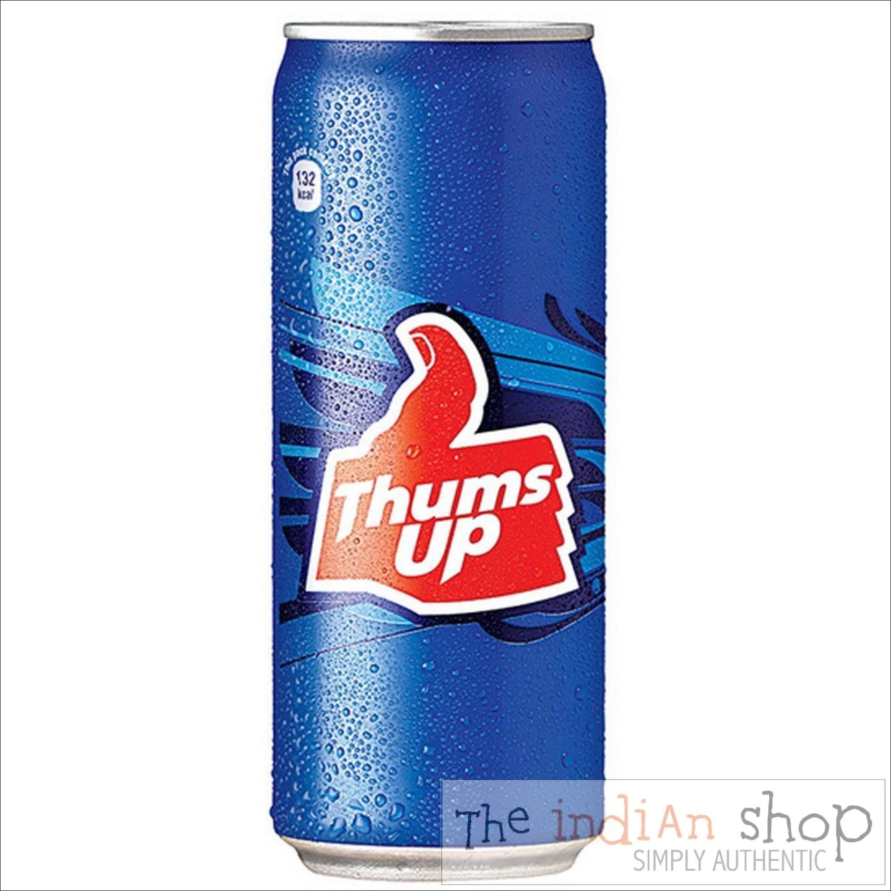
Even "simple" gestures and pictograms like "thumbs up" are not universal. In large parts of Europe and elsewhere, it is an insult meaning "sit on this thumb"! I expect that in such countries the drink below would be as successful as the Chevrolet Nova was in Spanish speaking countries


 Topic: Choosing between entry-level 12-bit DSOs (Read 361953 times)